How to create a graph chart in Excel
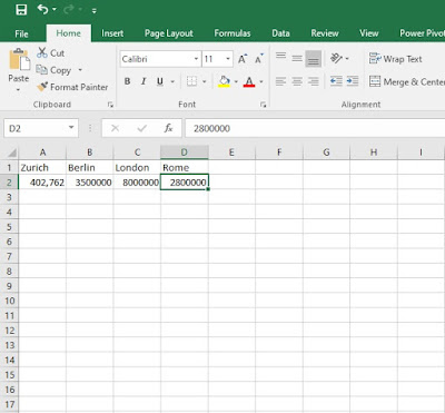
Hello everyone and welcome to another tutorial where this time I'm going to show you a simple step by step tutorial on how to create a graph in Excel in just under a minute. Firstly, before you start open Excel under a blank workbook and for a more simplified execution of this task as an example I'm using here city names and their population, that's what our graph is going to consist of.
1. First step what you're going to do is on the A1 to D1 column write the city names that you would want to use. After you've done that, on the A2 to D2 column write the population of those cities as in my example.
2. Step two, (make sure you've selected all the columns from A1 to D2) go to Insert and select the desired graph that you would want to use. In my case it's Insert statistic chart. As you can see from the picture below, on the red rectangle you can select different graphs and charts to choose from.
3. Once, you've selected the desired graph or chart in my case i'ts the statistic chart, it should appear as in the picture below, now if you're not happy with the design of the chart, you can easily change it as shows on the picture below (red pointer). Simply scroll over them and choose your favorite one.
4. Now that the chart is created, you can see from the picture above that the chart is formatted by default and it doesn't fulfill our visual requirements on what the final process should look like. Therefore, with a quick and easy formatting of the chart should do the trick. Simply, click on the plus shaped icon right next to the chart and a small window under the name chart elements will pop out. Once that does, check the box under the name Data Labels. Once you've checked the box, under the Data Labels a new small window will appear where you can select where the visual statistic would want to appear. In my case, I've clicked on Outside End. Here's the example in the picture below.
5. Next, if you click on the brush shaped icon right next to the chart a window will appear under the category Styles where you can select various designs and styles of your graph or chart. Click the one you like and the chart will automatically change it's style. For a simplified tutorial I've kept the style of the chart unchanged.
6. Next to the Style category, you're going to find the color category where you can scroll to you favorite colors that can suit your graph or chart. Simply select the colors that best suit your graph and the changes will be made automatically. Again, for a much simplified tutorial I've kept the colors unchanged.
7. Once you've finished with your graph or chart, but on the last minute you change your mind regarding the graph or chart type you can easily do that with just a few clicks. What you have to do is right click on the chart and a small window will appear where you have to click on the Change Chart Type.
8. When you click on the Change Chart Type this window will appear under the category All Charts. Once you finally decided what to type of graph or chart to use click the OK button and everything will be changed to your preferences. As you can see on the picture below, I went with the Line chart with a 3-D line preset.
9. Here is the 3-D Line chart that I've changed. Bare in mind that you have to redo the formatting for the visual categories under Chart Elements. Just click the categories that will most suit you under Chart Elements.
Here's also a video tutorial for you to see.


Comments
Post a Comment