How to create a unique target chart in Excel
Hello everyone, and welcome back to another tutorial where this time we're going to create a unique target chart using Microsoft Excel. If you've followed the previous posts you will get the idea on what we will try to do and shouldn't have any difficulties whatsoever.
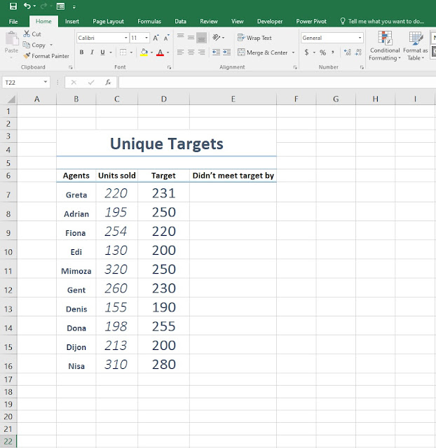
2. Step two, by now you probably noticed the headers consisting the Agents, Units sold, Target and Didn't meet target by. What you will do now is under the Didn't meet target by cell type the formula =MAX(D7-C7,0) in order to avoid the IF function we've added MAX instead, where we set 0 as our number limit so we don't have net results like -12, -25, -36 etc.

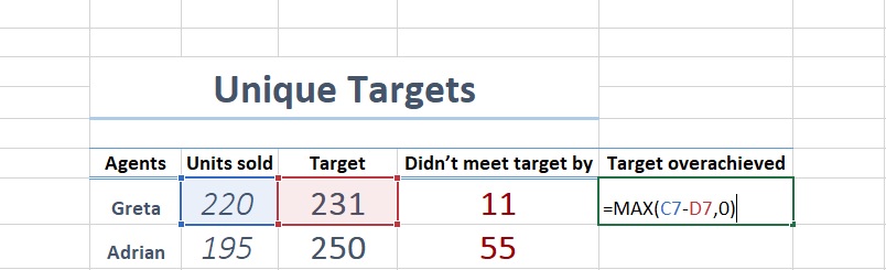
3. Step three, we've added another header Target overachieved where we will type the
formula =MAX(C7-D7,0). Once we've added the formulas on both headers, make sure you drag and drop so it will automatically calculate the remaining cells.
4. Step four, select the Target column without the header and alt+F1 to insert the bar chart.

5. Next, right click on the bar chart and select Change Series Chart Type.

6. Next, select Line > Line with Markers.

7. Once you click OK you are going to notice that the bar chart changed to a lined chart. But we don't want the lines. What we want is the dots for our target chart. So, click on the dot and select No Outline. Once you select that, you will get the same result as in the picture.

8. Go to Insert > Shapes > Line. Hold Shift and create a straight line. Once you've done that copy the line and paste it on the dots that we've created before. You should get the same result as in the picture.

9. Right Click on the number bar just at the bottom of the chart and click on the Select Data.

10. Instead of the numbers showing from 1 through 10. We want to show the names of our Agents. So after you clicked on the Select Data this window is going to show up. So your next step is to click on the table icon at the right side of the window and select the names of the agents and click OK.

11. Next, select the Units sold cells and copy and paste it in the chart. Once you do that, right click on the chart and go to Change Chart Type. Instead of Line with Markers, change it to Stacked Column.

12. Repeat the same step for the Didn't meet target by as in the previous step.

13. You will notice we now have too many bars on the primary axis, therefore we're now going to create a secondary axis. Copy the Target column and paste it again on the chart.
- Next, right click on the dot > Format Data Series > Secondary Axis.

14. Select the bar, Right click > No Fill.

15. Now copy and paste the Target Overachieved into the chart and repeat the formatting processes as in the previous steps.

- Note: After you change the bar into a stacked column, make sure you set it as a secondary axis.

16. Remove the gridlines and you'll be all set. Enjoy!

Here's also a video tutorial on how to create unique target chart
Comments
Post a Comment