How to create an actual cell vs target graph in Excel
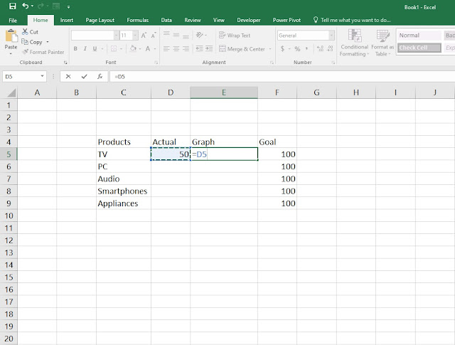
Hello everyone and welcome to another tutorial where this time we're going to see how you can make a very quick and simple actual cell vs target graph in Microsoft Excel in just a few easy steps. 1. First step, fill in the cells as seen on the picture bellow and write down the benchmark of units sold on the target or goal cell. Now that we have the benchmark of 100 units sold as our primary goal, head over to the actual cell and write down a random or in your case the actual number of units sold. Once you've done that on the graph cell type =D5 as seen on the picture where we will use the formula to show the graph in the next step. 2. Step two, once you click enter you will notice on the graph bar the progress is 50 units of the 100 target units sold. To add the graph go to Conditional formatting > New rule 3. When the New Formatting Rule window opens head over to Format Style and set it ...
Comments
Post a Comment