In cell vs target chart in Excel
Hello everyone and welcome to another tutorial where this time we're going to follow through our last exercise where we tweak some things and finish it off with a chart.
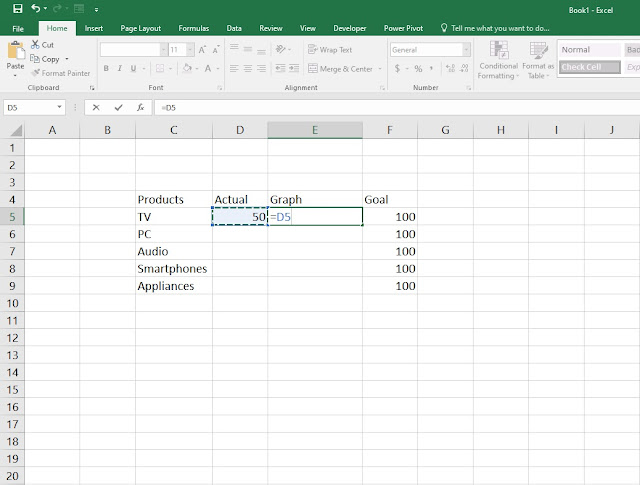
1 Step one, select the columns from A to T (or to any column you feel it's far enough), Right Click > Column width and set it to 17.

2. Step two, fill in the cells with the order you see in the picture down bellow.

3. Step three, under Conditional Formatting format the new rule and under Value > Maximum make sure you select the cell right beside Goal.
You probably know by now how you're supposed to format your new rule. If you're new to this tutorial then please visit our last exercise: https://letslearnitnow.blogspot.com/2020/04/how-to-create-actual-cell-vs-target.html

4. After you've successfully created the new rule, please do edit and format the table so it will have that clean look.

5. To create a bar chart please select all the cells and then go to Insert > Insert chart. When you click on the chart you will notice that the chart is not formatted with all of the necessary information. To do that, click on the + (chart elements) and a small window is going to appear and that is where you will find all the important data and information regarding your table. Play around the chart elements until you find your most important data to be displayed in your chart.

6. To further format your chart, double click on each bar where the Format Data Point side window will appear and there you're going to find a handful of categories where you can customize your chart. I've only added a shadow preset and changed the colors of each bar, but you could play around and add more customization to your chart.

7. And there you go, here you have the January report in both graph bar and chart display. To remove the guidelines in Excel, go to View and click on the Gridlines. By doing that, the gridlines will disappear.

8. If you want to add more tables and charts for each of the months, simply copy and paste the table where you want it and change the numbers for that particular month and then insert the chart. Your spreadsheet should look similar to the picture below.
Note: Instead of having all the months in one spreadsheet, you can also create a new spreadsheet for each month.

Here's also the video showcase...
Comments
Post a Comment